How to make transparent letters. Creating a stencil in MS Word Empty letters with an outline
The question of how to make a stencil in Microsoft Word is of interest to many users. The problem is that finding a sane answer to it on the Internet is not so easy. If you are also interested in this topic, you have come to the right place, but first, let's figure out what a stencil is.
A stencil is a "perforated plate", at least that is the meaning of this word in an exact translation from Italian. We will briefly talk about how to make such a “plate” in the second half of this article, and directly below we will share with you how to create the basis for a traditional stencil in Word.
If you are ready to seriously get confused by connecting your imagination in parallel, you can use any font provided in the standard set of the program to create a stencil. The main thing, when it is printed on paper, is to make jumpers - places that will not be cut out in letters bounded by an outline.

Actually, if you are ready to sweat over the stencil so much, it is not clear why you need our instructions, since you have all the MS Word fonts at your disposal. Choose the one you like, write a word or type the alphabet and print on the printer, and then cut them out along the contour, not forgetting the jumpers.

If you are not ready to spend so much effort, time and energy and the classic-looking stencil suits you perfectly, our task is to find, download and install the same classic stencil font. We are ready to save you from an exhausting search - we found everything on our own.
![]()
The Trafaret Kit Transparent font completely imitates the good old Soviet TSh-1 stencils with one nice bonus - in addition to the Russian language, it also has English, as well as a number of other characters that are not in the original. You can download it from the author's website.
Installing the font
In order for the font you downloaded to appear in Word, you must first install it on the system. Actually, after that it will automatically appear in the program. You can learn how to do this from our article.

Creating the base for the stencil
Select Trafaret Kit Transparent from the list of fonts available in Word and create the desired inscription in it. If you need an alphabetic stencil, write the alphabet on the document page. Other characters can be added as needed.

The standard portrait orientation of a sheet in Word is not the best solution for creating a stencil. On the landscape page, it will look more familiar. Our instruction will help you change the position of the page.

Now the text needs to be formatted. Set the right size, choose the right position on the page, set sufficient indents and spacing, both between letters and between words. Our guide will help you do it all.

Perhaps the standard A4 sheet size will not be enough for you. If you want to change it to a larger one (A3, for example), our article will help you do this.

Note: When changing the sheet format, do not forget to change the font size and related parameters proportionally. Equally important in this case are the capabilities of the printer on which the stencil will be printed - support for the selected paper size is required.
Screen printing
Having written the alphabet or inscription, having formatted this text, you can safely proceed to printing the document. If you still don't know how to do this, be sure to check out our instructions.

Create a stencil
As you understand, there is practically no sense from a stencil printed on a regular piece of paper. More than once they are unlikely to be used. That is why the printed page with the stencil base needs to be “strengthened”. For this you will need the following:
- Cardboard or plastic film;
- Carbon paper;
- Scissors;
- Shoe or clerical knife;
- Pen or pencil;
- Board;
- Laminator (optional).
The printed text must be transferred to cardboard or plastic. In the case of transferring to cardboard, ordinary carbon paper (carbon paper) will help to do this. You just need to lay the stencil page on cardboard, placing a carbon paper between them, and then trace the outline of the letters with a pencil or pen. If there is no carbon paper, you can push through the outlines of the letters with a pen. The same can be done with transparent plastic.
And yet, it is more convenient with transparent plastic, and it would simply be more correct to do it a little differently. Place a sheet of plastic on top of the stencil page and trace the outlines of the letters with a pen.
After the stencil base created in Word is transferred to cardboard or plastic, all that remains is to cut out the empty spaces with scissors or a knife. The main thing is to do it strictly along the line. It is not difficult to drive the knife along the border of the letter, but the scissors must first be “driven” into the place that will be cut out, but not into the edge itself. It is better to cut plastic with a sharp knife, after placing it on a solid board.
If you have a laminator handy, the printed sheet of paper with the stencil base can be laminated. Having done this, cut out the letters along the contour with a clerical knife or scissors.
When creating a stencil in Word, especially if it is an alphabet, try to make the distance between letters (on all sides) no less than their width and height. If this is not critical for the presentation of the text, the distance can be made a little larger.
If to create a stencil you did not use the Trafaret Kit Transparent font offered by us, but any other (non-stencil) font presented in the standard Word set, we recall once again, do not forget about the jumpers in the letters. For letters whose contour is limited by the internal space (an obvious example is the letters “O” and “B”, the number “8”), there must be at least two such jumpers.
That's all, in fact, now you know not only how to make a basis for a stencil in Word, but also how to make a full-fledged, dense stencil with your own hands.
Login to write a reply
Outline fonts
In section Software to the question of how to make a letter outline given by the author in a Word Alexander Belinin the best answer is From below, look for the inscription - insert Word art objects (Letter A is drawn in blue). The first style of the inscription is the outline of the letters. Just choose the size and style of the font.
22 answers
Hey! Here is a selection of topics with answers to your question: how to make a letter outline in Word
Answer from leak out
If you mean a letter written in a font with dotted lines, then no way. By default, fonts are usually created as follows: regular, bold, italic, bold italic (but there may be others), each letter is written in a special file with a font, so if the font creator did not do “letter outline”, then you can’t do it in any way receive. Perhaps on the Internet there is a font you are interested in, you need to look for it.
vitriol
In Word 2010 Font / Text Effects / Text Outline. I don't remember previous versions. Also look for the Font option. Or via WordArt.

Answer from Agnessa Tina
Thank you very much Konstantin is a genius, I have been looking for a long time and today I made a table of hundreds
2 answers
Hey! Here are some other threads with relevant answers:

The question of how to make a stencil in Microsoft Word is of interest to many users. The problem is that finding a sane answer to it on the Internet is not so easy. If you are also interested in this topic, you have come to the right place, but first, let's figure out what a stencil is.
A stencil is a "perforated plate", at least that is the meaning of this word in an exact translation from Italian. We will briefly talk about how to make such a “plate” in the second half of this article, and directly below we will share with you how to create the basis for a traditional stencil in Word.
Lesson: How to make a document template in Word
Font selection
If you are ready to seriously get confused by connecting your imagination in parallel, you can use any font provided in the standard set of the program to create a stencil. The main thing, when it is printed on paper, is to make jumpers - places that will not be cut out in letters bounded by an outline.

Lesson: How to change the font in Word
Actually, if you are ready to sweat over the stencil so much, it is not clear why you need our instructions, since you have all the MS Word fonts at your disposal. Choose the one you like, write a word or type the alphabet and print on the printer, and then cut them out along the contour, not forgetting the jumpers.

If you are not ready to spend so much effort, time and energy and the classic-looking stencil suits you, our task is to find, download and install the same classic stencil font. We are ready to save you from an exhausting search - we found everything on our own.

The Trafaret Kit Transparent font completely imitates the good old Soviet TSh-1 stencils with one nice bonus - in addition to the Russian language, it also has English, as well as a number of other characters that are not in the original. You can download it from the author's website.
Download Trafaret Kit Transparent Font
Installing the font
In order for the font you downloaded to appear in Word, you must first install it on the system. Actually, after that it will automatically appear in the program. You can learn how to do this from our article.

Lesson: How to add a new font to Word
Creating the base for the stencil
Select Trafaret Kit Transparent from the list of fonts available in Word and create the desired inscription in it. If you need an alphabetic stencil, write the alphabet on the document page. Other characters can be added as needed.

Lesson: Inserting characters in Word
The standard portrait orientation of a sheet in Word is not the best solution for creating a stencil. On the landscape page, it will look more familiar. Our instruction will help you change the position of the page.

Lesson: How to make a landscape sheet in Word
Now the text needs to be formatted. Set the right size, choose the right position on the page, set sufficient indents and spacing, both between letters and between words. Our guide will help you do it all.

Lesson: Formatting text in Word
Perhaps the standard A4 sheet size will not be enough for you. If you want to change it to a larger one (A3, for example), our article will help you do this.

Lesson: How to change sheet format in Word
Note: When changing the sheet format, do not forget to change the font size and related parameters proportionally. Equally important in this case are the capabilities of the printer on which the stencil will be printed - support for the selected paper format is required.
Screen printing
Having written the alphabet or inscription, having formatted this text, you can safely proceed to printing the document. If you still don't know how to do this, be sure to check out our instructions.

Lesson: Print documents in Word
Create a stencil
As you understand, there is practically no sense from a stencil printed on a regular piece of paper. More than once they are unlikely to be used. That is why the printed page with the stencil base needs to be “strengthened”. For this you will need the following:
- Cardboard or plastic film;
- Carbon paper;
- Scissors;
- Shoe or clerical knife;
- Pen or pencil;
- Board;
- Laminator (optional).
The printed text must be transferred to cardboard or plastic. In the case of transferring to cardboard, ordinary carbon paper (carbon paper) will help to do this. You just need to lay the stencil page on cardboard, placing a carbon paper between them, and then trace the outline of the letters with a pencil or pen. If there is no carbon paper, you can push through the outlines of the letters with a pen. The same can be done with transparent plastic.
And yet, it is more convenient with transparent plastic, and it would simply be more correct to do it a little differently. Place a sheet of plastic on top of the stencil page and trace the outlines of the letters with a pen.
After the stencil base created in Word is transferred to cardboard or plastic, all that remains is to cut out the empty spaces with scissors or a knife. The main thing is to do it strictly along the line. It is not difficult to drive the knife along the border of the letter, but the scissors must first be “driven” into the place that will be cut out, but not into the edge itself. It is better to cut plastic with a sharp knife, after placing it on a solid board.
If you have a laminator handy, the printed sheet of paper with the stencil base can be laminated. Having done this, cut out the letters along the contour with a clerical knife or scissors.
When creating a stencil in Word, especially if it is an alphabet, try to make the distance between letters (on all sides) no less than their width and height. If this is not critical for the presentation of the text, the distance can be made a little larger.
If to create a stencil you did not use the Trafaret Kit Transparent font offered by us, but any other (non-stencil) font presented in the standard Word set, we recall once again, do not forget about the jumpers in the letters. For letters whose contour is limited by the internal space (an obvious example is the letters "O" and "B", the number "8"), there must be at least two such jumpers.
That's all, in fact, now you know not only how to make a basis for a stencil in Word, but also how to make a full-fledged, dense stencil with your own hands.
We are glad we were able to help you resolve the issue.
Ask your question in the comments, describing in detail the essence of the problem. Our experts will try to answer as quickly as possible.
Did this article help you?
In some cases, for aesthetic reasons, you want to form the so-called "empty inside" signs.
Technically, these are white characters bordered by a dark (usually black) border.
Such signs are easy to create in Word using the option Text effects.
To do this, select one or more characters (letters, numbers, punctuation marks, etc.) (to demonstrate the white color inside, they must be quite large).
Option Text effects in Word 2010 opens like this: tab home- Group Font- arrow to open the dialog box Font- button Text effects that opens a window Text Effect Format.
Set the outline of the text in the window Text Effect Format: tab Text Outline - Solid Line - Color: Black.
Next, set the text fill in the same window Format Text Effects: tab Text Fill - Solid Fill - Color: White.
Close the window Text Effect Format(button close- button OK) and get signs with the desired effect.
Post's attachments
Blank signs.jpg
Blank signs.jpg 6 Kb, 1 downloads since 2012-11-16
You don't have the permssions to download the attachments of this post.
Convenient and pleasant work in Word!
Transfer thanks to Yandex wallet - 41001162202962; to WebMoney - R581830807057.
A professional document should not only be designed according to GOST standards, but also look beautiful. Beautiful text is an added bonus.
In the Word editor, fonts, margins, numbering, styles and much more are responsible for the beauty of the text, but in this article we will talk about effects that will help make a design masterpiece out of a regular headline.
- Text effects in Word:
- preset styles;
- Structure;
- Shadow;
- Reflection;
- Backlight.
- An example of how to make beautiful text in Word:
- Choose a beautiful font for the text;
- Editing text in a document;
- We create beautiful text design.
Text effects in Word
The Word editor includes a huge number of text effects, using which you can give an individual style to any document.
Of course, you should not overdo it with effects, they should be used only where it is appropriate and only in the quantity that is needed.
Adding effects is done as follows:
- Select the part of the document you are interested in.
- Go to the "Home" tab.
- In the "Font" block, activate the "Text Effects and Appearance" command.
- Select the desired effect from the dropdown list.
Let's list the available text effects in Word.
Preset Styles
The developers offered to choose from, their list of 15 preset styles with built-in effects for text.
- Fill - black, text 1 with shadow.
- Fill - blue, accent 1 with shadow.
- Fill - orange, accent 2, outline - accent 2.
- Fill - white, outline - accent 1 with shadow.
- Shading - golden, accent 4, soft baguette frame.
- Gradient fill - grey.
- Gradient fill - blue, accent 1, reflection.
- Gradient fill - gold, accent 4, outline - accent 4.
- The fill is white, the outline is accent 1, the highlight is accent 1.
- Fill - gray 50%, accent 3, rough baguette frame.
- Fill - black, text 1, outline - background 1, heavy shadow - background 1.
- Fill - dark blue, text 1, outline - background 1, heavy shadow - background 1.
- Fill - blue, accent 1, outline - background 1, heavy shadow - accent 1.
- Fill - white, outline - accent 2, heavy shadow - accent 2.
- Fill - gray 25%, background 2, shadow inside.

Structure
Using commands from the "Structure" category, you can set the text color, change the font thickness and assign the line type.

Very often there are cases when you need to add volume to the text. Shadows, the most effective way to solve this problem.
In the range of the Word editor, there are:
- outdoor shadows;
- Inner shadows;
- perspective shadows.
To create your own version of the shadow, use the "Shadow Options" command.

If you want to remove the shadow from the text, select the "No shadow" option.
Reflection
The text with reflection looks very nice and stylish. There are 9 options to choose from with different offsets and reflection thicknesses.
You can set your own text reflection style in the Reflection Options command.

The "No reflection" command removes the effect from the text.
Backlight
Highlighting gives the text a glow. There are 24 effect options in the set, or rather 6 options with different color effects and 4 for each with increased illumination.

Sample how to make beautiful text in Word
Now that we are familiar with the effects options in the Word editor, it's time to show imagination and make beautiful text in the document, on our own.
For example, let's take any text in which we will design beautiful headings.
Choosing a beautiful font for text
There are a lot of beautiful fonts. There are fonts for business documents, there are fonts for children's topics, and so on.
You can choose the font to suit your needs on the website
It is necessary to understand what font will be initially chosen, and such an attitude to the document will be. And no matter how it is designed, 80% of success should be given to fonts.
In my case, I'll choose the font "Roboto", I really like this design, modern, not too wide and easy to read.

Editing text in a document
At the next stage, it is necessary to arrange all the indents, margins and separate one part of the text from the other so that nothing merges.

Create beautiful text design
At the beginning of the article it was mentioned that an overabundance of effects will not improve, but worsen the perception. After experimenting a little, I came to the conclusion that the best design option would be like this:

Just the heading was nicely done. Assigned 13 preset styles, added a reflection and enlarged the font.
The subheading is highlighted in a different color so that it differs from the main one.
This is where it should end, since the main elements are quite readable. They are clearly visible, but at the same time they do not interfere with reading the article.
Experiment with beautiful text in Word and send your design options in the comments.
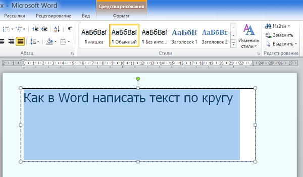
One such tool is Text Warp. With this tool, you can make text, for example, wavy, as well as write it along the contour of a circle and, of course, along many other intricate contours.
The "Text Warp" tool is part of the "Word Art" functionality and hides from our eyes in the "Format" tab of the top menu related to the "Drawing Tools" section. In order for the “Drawing Tools” section to provide all its functionality at our full disposal, we need to use the option, well, or the “Create an inscription” tool (we are talking only about text today), which (th) is located on the options ribbon of the “Insert” tab top menu:
Or you can activate the "Create an inscription" tool through the "Shapes" functionality of the same "Insert" tab of the top menu:

As soon as we select the Create Label tool, the cursor will take the form of a two-dash crosshair. Such a modification of it is a signal that it is possible to start creating a working field for the future text. The field we draw will look like a rectangle, which we can stretch horizontally (width) or vertically (height) or make it square. It all depends on what we want to get as a result. That is, on how we want the text to flow around this or that contour, well, on editing the text itself.
From the above, it may well give the impression that we will have to puff at the very beginning of working on a non-standard text form. But it's not. We do everything without any tension, enjoying the creative process.
The field is drawn when the left mouse button is pressed and held:

As soon as we release the left mouse button, the field can be considered created:

This created field is immediately captured by the transform markers. By grabbing a particular marker with the mouse, the field can be stretched in height, width and increase its size, while maintaining the proportions (any of the corner markers):

A pulsating text input cursor will appear inside the newly created field:

We can start typing in the most common way. That is, horizontal and, if necessary or desired, even several lines. Let's do this, limiting ourselves to one line for now:

We do not need to worry about the fact that we entered the text using a small font size, or vice versa, wrote in a large font, or even in the wrong form. We can edit the text entered in the field as we wish. This also applies to the future text, which we act on using the Text Warp tool, which is located in the WordArt Styles section of the Format tab:

Now I will increase the size of the font entered in the text field so that it is better visible, and as proof of the possibility of editing it inside the field:
In my case, and at the moment, the “Format” tab (we can see it as a menu item) is available, but the options contained inside it are not visible to us (picture above). By clicking the left mouse button on the name of this tab, I will expand its contents:

Now the functionality of the "Format" tab is completely at our service. As soon as we open the contents of the “Text Warp” by clicking the left mouse button, everything will immediately become clear to us - how we can write text in a circle and other contours, as well as give it other bizarre shapes. Let's make this very click and look at the functionality of this tool:

In the drop-down list, the tool we need will be listed as the "Convert" option. As soon as we reveal its functionality, it may very well be that, replacing each other, new creative ideas and ideas will immediately begin to appear:

How our text changes in the field, we can already see when we just hover over any of the proposed forms:

By clicking the left mouse button we confirm the choice of one form or another.
In most cases, the visibility of the text field created by us with the “Create Label” tool turns out to be very inopportune, but we will not worry about this, since we can make this very field completely invisible at any time. But we will not rush to make the field invisible, but we will deal with the discrepancy that takes place.
This discrepancy is expressed in the fact that, having selected the text shape along the contour of a circle, in the field I received text written along the contour of an ellipse, and not at all in a circle. What is the matter here? Why is there such a discrepancy? The answers to these questions are hidden behind the field size, font size and font length (number of words and spacing between words). We can influence the text in a complex way, or we can, for example, only change the size of the font itself or the spacing between words, or only the width and height of the field, etc. It all depends on how we want to see the text as a result. That is, how the text will wrap around some object along its contour.
Let's start with the field. Move the mouse cursor over any of its sides and click the left mouse button. The cursor will take the form of a crosshair of four small arrows, and the field will be captured by the transform markers:

Let's grab the middle top marker with the mouse and drag the box up, and then release the mouse button and look at the changes that the text has undergone:

We see that the bend of the text straightened out very noticeably and became more like a text written in a circle, or rather in a part of a circle - its half.
Since the circle inscribed inside the square is an ideal circle, and not an ellipse (jokingly), then by making the field, even if “by eye”, square, we may well assume that this text is written along the contour of the circle. Let's grab any of the side markers of the field with the mouse and pull it in the right direction, thus making the field square from a rectangular field. And here's what happened:

As we can see, the text does not close in a circle, and our task, for example, is to make the text flow around the represented closed circle contour. The easiest way to make the text "closed" is to reduce the margin while maintaining its proportions. As the margin shrinks, the text will re-arrange itself to fit within the shrinking margin space, according to the circular pattern we have chosen. The text will also behave when we select any other template.
To reduce the size of the field while maintaining proportions, grab any of the corner markers with the mouse and drag it to the represented center of the field:

We can make stops - release the left mouse button and look at how the text has changed. Then again grab the corner marker with the mouse and continue dragging, reducing the size of the field, keeping the shape of a square. As a result, we will get the text along the contour of the circle:

With such an impact on the text, you need to take into account the fact that the font size will decrease. We see how much smaller the field itself and the text are now.
Since we are talking more about the techniques of working with the Text Warp tool, and not about decoration and design, it is difficult to give advice, because creativity is a very individual process. In addition, the tasks assigned to us in the process of study or work are also very different. I say this to the fact that we can close the text by increasing its size:

To change the font size and shape - for example, change Tahoma to Arial or change font colors - apply WordArt styles to the text:

or some other effects, for all such changes it is enough to select the field itself by clicking the left mouse button (the field will be captured by markers):

and then act on the text as we want. At the same time, we must take into account the fact that after applying some effects and styles, for example WordArt, our beautiful round text will not only become even more beautiful, but will change its location along the contour, and besides, in such a way that we will have to edit it again . Therefore, it makes sense to first apply effects and styles, and then work with the text, giving the desired shape. But this, of course, as one of the options, and so we act based on our own preferences.
Let's pay attention to the diamond-shaped pink marker that appears when the field is selected and superimposed on the left side transform marker:

By grabbing that pink handle with the mouse, and dragging it inside the box, we can also affect the text by changing its outline wrapping, size, and writing start point. As soon as we grabbed the marker and started moving it, guide lines will immediately appear inside the field, along which the marker-regulator can move, and with it the text (the selected form template):

By dragging the marker just a bit, and then releasing the left mouse button, we can see the changes that the text has undergone:

Then we grab the marker again with the mouse and move it a little more and, releasing the left mouse button, again look at what happened to the text:

If we match the pink handle with the right side transform handle, our text will be the same again, only now it will be written differently:

When choosing other options for curving the text, we can see a different initial position of the marker-regulator, and when it is moved, completely different lines that guide its movement:

When writing text along the contour of a circle, we don’t have to do everything by eye (transformation of the “Create inscription” field to the shape of a square). We can temporarily place some external object in the shape of a circle, or, using the "Shapes" functionality of the "Insert" top menu tab, draw a circle (circle) and adjust the field with it. We draw a perfect circle (circle) by holding down the Shift key:

It may very well be that someone finds it convenient to make the field transparent even before entering the bizarrely twisted text. Let's achieve this same 100% transparency of the field.
So, we want to write text along the outline of a circle. By clicking the left mouse button, expand the "Insert" top menu tab, and then the contents of the "Shapes" functionality, where we select the "Oval" shape:

As soon as we selected the “Oval” shape, the cursor took the form of a crosshair of two dashes. Let's press Shift key and continue to hold it. Then by pressing and holding the left mouse button, we will start drawing a circle:

When we stop and release the left mouse button, then the shape can be considered drawn. At any time, we can increase or decrease the figure by dragging any of the corner markers with the Shift key pressed and held to maintain the proportions of the figure.
The circle is drawn, and you can start creating a field for future text. Select the "Create Label" tool:

If, after the circle was drawn, we did not click the mouse, then the transformation markers still hold the circle. If the coverage of the circle by markers is gone, then move the mouse cursor over the body of the circle and click the left mouse button so that the markers capture the circle again. Now select the "Create Label" tool again. All we need to do is stroke the square selection of the circle. We can start the selection stroke (creating a square box for the text) from any corner marker. That is, we draw a field for the future text right on the selection of the circle:

So, the text input field is created:

Now enter the text in the field:

At the end of text input using the tool already known to us, we will make it written along the contour of the circle:

So, the desired template is selected and this is the result:

In my eye, the text along the contour is slightly elongated vertically, since the text input field I created initially turned out to be not quite square. Now let's make the field completely transparent (without white fill and outline).
At the moment, the field is highlighted with transform handles, which allows us to immediately start setting 100% transparency and removing the outline. To this end, we rush the mouse cursor to the top menu of the “Format” tab and select the necessary options in sequence (highlighted in yellow):

The outline of the field has disappeared. Again we rush to the "Shape Styles" section of the "Format" tab of the top menu, but now we use the options of the "Shape Fill" functionality:

When you select No Fill, the white background of the field disappears. In some cases this does not happen. If suddenly, after choosing the “No fill” option, the desired and visible changes did not occur, then we can use other options for filling the shape. We make a choice of a gradient fill, and then a variant of other gradient fills:

And a settings window appears in front of us, in which we set the transparency level to 100% by moving the slider:

By clicking outside the circle, we will remove the selection with markers in order to see how everything looks without extraneous lines (selection):

If we consider that the text is not written in a perfect circle, then we can additionally move the side markers of the already invisible field. Let's move the mouse cursor over the text and make a normal click. The field along with the text will be captured by the selection markers, and at this moment the text will change, losing the curvature along the outline of the circle:

Such changes should not shock us. We simply expand the "Format" tab and reshape the text by choosing the shape of the warp along the outline of the circle, and then make the desired adjustment. And we can not do this, but immediately begin the transformation of the field. As soon as we start the transformation by grabbing some kind of marker with the mouse, the text will immediately curve along the outline of the circle, and we will be able to observe its changes.
So, we have corrected the field, and with it, respectively, the text. Since in our example the circle played the role of an auxiliary element, now we need to remove it. In order to delete a circle, you must first select it (the circle will be captured by the selection and transformation markers). The text field interferes with the selection of the circle. Although we made the field completely transparent, it has not gone away, but is in the foreground, covering the circle. Let's move the text field to the side, select the circle, and then delete it.
Let's move the mouse cursor over any of the sides of the field selection and as soon as the cursor takes the form of a crosshair of 4 small arrows, grab the field with the mouse and move it to any side, thus opening ourselves access to the circle selection:

Now let's move the mouse cursor over the body of the circle and left-click to select:

The final action in the procedure for getting rid of the circle is to press the Delete key:

Another option for removing the circle is to move the text box to the background, that is, behind the circle. We do this kind of movement with two clicks of the left mouse button. With the first click, select the field with the text, and with the second click, select the “Move Back” option or the “Send to Back” option. I chose the "Send to Back" option:

The field with the text is located behind the circle. Now let's do the familiar steps. Let's make a mouse click on the body of the circle to select:

and then press the Delete key. If we considered that the distance between the words indicated by the arrow is too large:

then we need to reduce the margin a bit, keeping its proportions, so as not to disturb the perfect curvature of the text along the outline of the circle. Or move the marker-regulator a little:

We can apply not only WordArt styles to our text, but also rotate it, skew it or put it:

You can do all this using the Shape Effects option:

Well, our conversation about how to write text in a circle in Word is coming to an end. Having chosen other options for fancy text distortion, we already know how we can additionally influence it.
We will talk about how to write text along the contour of a circle, consisting of several lines, separately.
In some cases, for aesthetic reasons, you want to form the so-called "empty inside" signs.
Technically, these are white characters bordered by a dark (usually black) border.
Such signs are easy to create in Word using the option Text effects.
To do this, select one or more characters (letters, numbers, punctuation marks, etc.) (to demonstrate the white color inside, they must be quite large).
Option Text effects in Word 2010 opens like this: tab home- Group Font- arrow to open the dialog box Font- button Text effects that opens a window Text Effect Format.
Set the outline of the text in the window Text Effect Format: tab Text Outline - Solid Line - Color: Black.
Next, set the text fill in the same window Format Text Effects: tab Text Fill - Solid Fill - Color: White.
Close the window Text Effect Format(button close- button OK) and get signs with the desired effect.
Post's attachments
Blank signs.jpg
Blank signs.jpg 6 Kb, 6 downloads since 2012-11-16
You don't have the permssions to download the attachments of this post.
Convenient and pleasant work in Word!
Transfer thanks to Yandex wallet - 41001162202962; to WebMoney - R581830807057.
Topic status: Closed.
-
I'm sitting, not touching anyone, primus: computer: fixing
Topic status: Closed.
best answer
D1mkO 4 (2071) 1 4 8 years
You type the desired text, then select it, then your actions: FORMAT -> FONT, there in the "Modify" subsection you put a checkmark next to "outline" 😉
I hope it's clear and on topic =)
Answers
buy_elephant 7 (30141) 5 19 86 8 years old
I don’t know how in Word, I know that in Photoshop it’s filter -> stylize -> find egdes
blblblbl 8 (115667) 8 15 115 8 years old
This is done in Photoshop.
VuVuZeLa (27) 6 (9756) 5 21 62 8 years old
The one who understood that it is necessary to erect a monument
- How to make in Worde the color of the letters in the word be gray and the outline black?
In the menu Format->Font like...
- How to make a dash above the letter in Word?
Insert-Object-Microsoft Equation
Insert-Object-Microsoft Equation
- How to put text along the contour in word 2007 in a round shape?
In general, Word is a text editor and it works with graphics as much as it can, but it does not support such a function as text on a path at all.
- How to highlight the outline of an image? What is the easiest program to do this?
adobe photoshop - the magic one , esli eto , to o chem ja podumala or lasso tool
- Word does not correct errors in Russian letters?
Correcting errors in Word does not require Proofing Tools. You just need to set the settings in Word.
1. open Word
2. tools
3 options
4. there is one of the bookmarks - Spelling & Grammar
5. check the boxes if you need correction when writing, etc. - I have a problem with Word'om! I do not put garumzime on the letters - i, l. What could be the problem?
do not put (what they do)
Interferes with the Intel video card driver. Remove hkcmd.exe from processes - everything will work. And in general, how do you not follow what processes are loaded at startup? Or your administrator is not fulfilling his duties, again ..
- why Word does not correct errors in Russian letters?
By default, Word does not check Russian spelling.
Install Microsoft Proofing Tools. If necessary, write in person, I'll throw off the thread. - In Word, the cursor is placed on the letter itself - how to remove it?
insert button
- I clicked on something in Word. Now adjacent letters are erased if I write new ones. How to fix?
Press Insert
- I wonder if it is possible to add letters in wordArt in addition to the standard ones?
I allow))
add if you are a hacker..
 How to store porcini mushrooms after harvest and for the winter
 Speed regulator for grinder - to make the machine more reliable and functional
 choice of strategic alternatives