Why room design in purple tones is a rarity
Purple not often can be found in residential buildings, as actually in nature. At the same time, many of this color love, but they are afraid to risk and use purple tones in the design of the rooms. Too much around this color of myths and stereotypes. Which ones are, however, and which are not the slightest foundation - we will find out.
Studio Archivizer.
Basic principles of using purple tones for room design
Spokon centuries This color was considered a sign of wealth and bohemity. In many countries, only the Official of Royal Blood could wear it. It was associated with difficulties in making a pigment, which could only be made of mollusk shells. Today, violet color is no longer anything special, unusual, while still continues to be associated with luxury and exclusivity.
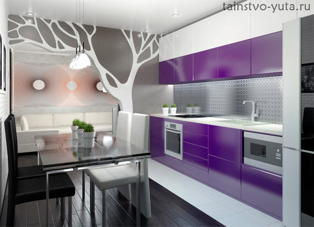
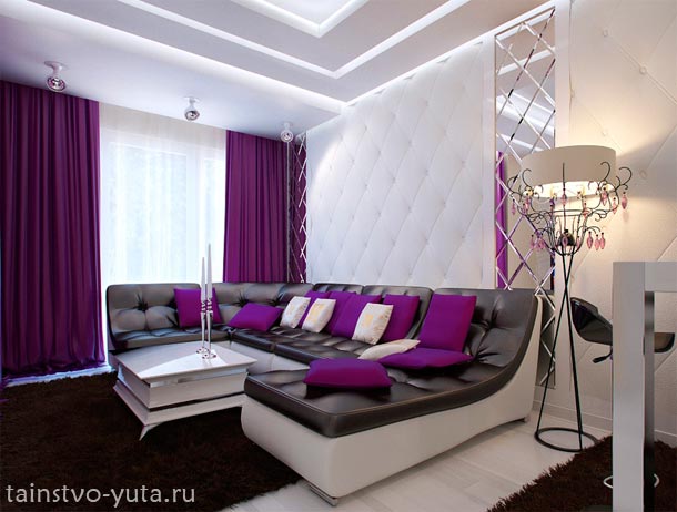
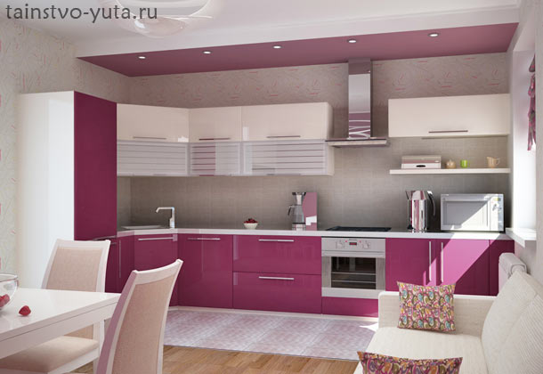
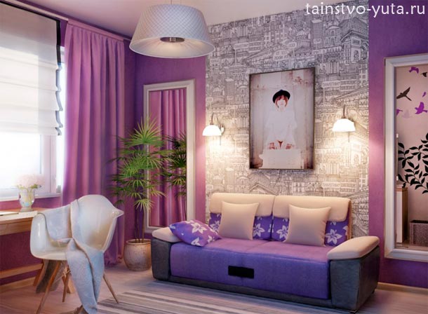
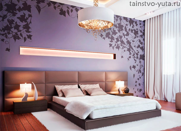
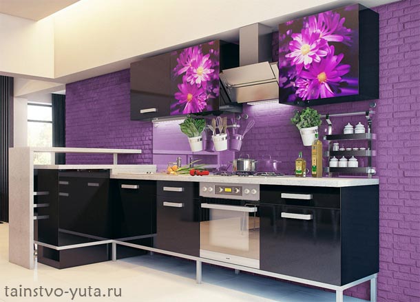
By itself, purple is rather dark enough, if not saying gloomy color. Therefore, for the design of residential premises for the most part, brighter and soft shades (lavender, ink, amethyst, lilac, fuchsia, phlox lilac) are used. They are softer and universal, which allows them to apply them in children's, living rooms or in kitchens. Not diluted color winning looks in limited quantities. In this case, it does not inhibit, but on the contrary attaches the interior of elegance and nobility.
![]()
For design, what rooms are the shades of violet suitable? Of course, you can restrict ourselves to the dry list of the names of the premises, but I want you to understand the reason why this color is not used in certain places. And this is associated with the peculiarities of its impact on the psyche, performance and mood of man.
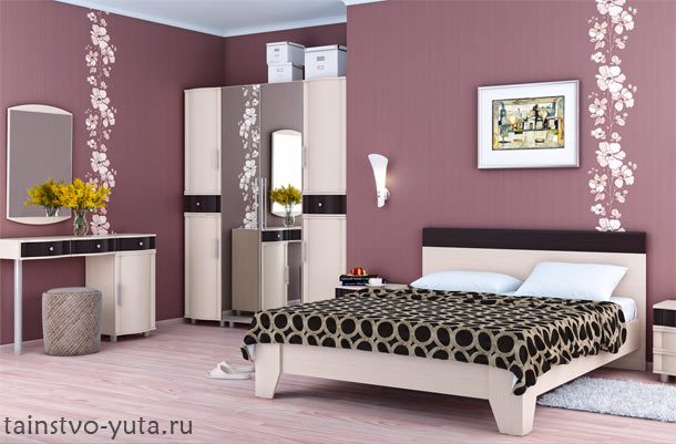
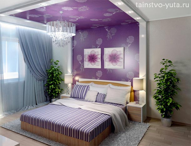
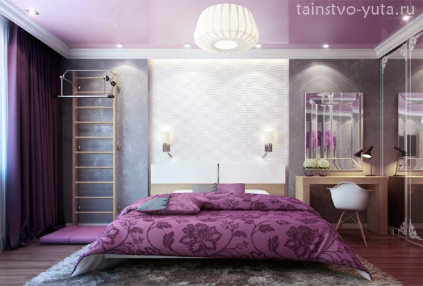
So, purple helps relieve emotional tension, relax, stimulates imagination and intuition. In large quantities reduces performance and physical activity. Prefer this color people prone to creative professions, emotional and impressionable. From the above, it can be concluded that this color is not suitable for registration of children's and (if you are certainly not a musician or artist), but perfectly fit into the room for meditation, bedroom, or the boudoir.
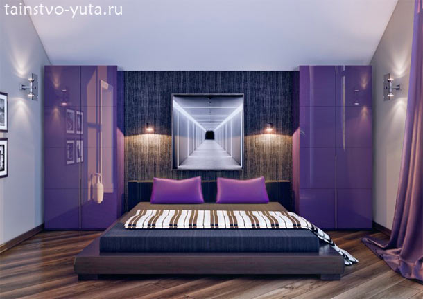
Design Artem Lazarev
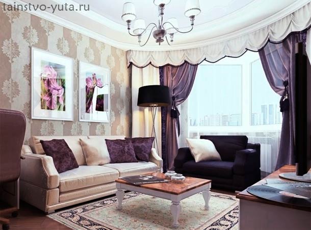
If, weighing everything in and against, you still decided to use purple tones in the design of the room, it would not be superfluous to know with what other colors it is better to combine. The most elegantly the combination of violet with gold looks like this is true only for luxurious oriental or. However, if you replace gold on yellow or yellow-orange, it is no less harmonious tandem that will fit into any style.
The combination of lilac with green, beige, gray, white and pink is also well aware. The main rule is to use fairly contrasting color, that is, if you have chosen a rather dark rich shade of purple, it needs to be diluted with lighter collers. And, on the contrary, pick up darker and rich additional colors to pastel lilac colors.
Purple is really a rare guest in the interiors, however, to give up its preferences, just because it is not accepted - it is not worth it. Each color and shade has its own unique and unique properties. So, for example, the design of the room in purple tones can be mysterious and mysterious, elegant and luxurious. Not many other colors can create a similar atmosphere.
 Facade design of a country house: a variety of stylistic directions
 Wooden ceilings - 25 interior examples
 How to make a children's game lick with your own hands