Which color paint walls: nuances of choice paint palette
Deciding on how to paint the walls in different rooms at home or apartment, it is necessary to take into account the many nuances and rules. Following the existing recommendations will allow you to get an attractive and harmonious premises that will not deliver discomfort. When choosing a shade should be paid attention not only to classic, traditional solutions, but also to evaluate the options offered by the teachings of Fengshui.
All colors are conditionally divided into three categories:
- Cool. This group includes purple, green, blue, blue gamut. Suitable for bright illuminated rooms located on the south side.
- Warm. Include yellow, red, orange palette. Are an excellent solution for the Northern side with insufficient natural lighting.
- Neutral. Traditional gray, white and black shades.
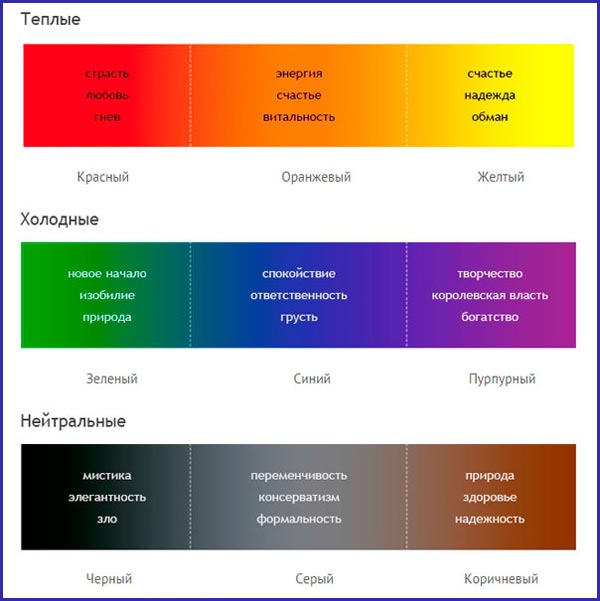
Each of the options has a certain impact on the emotional and mental state of the person. Some tones can cause aggression and anxiety, others, on the contrary, relax, set up a calm way or contribute to creative and business lifting.
Secrets of successful choice
When choosing a color gamut, individual preferences have priority. But to make such a responsible decision, you can use the recommendations that allow you to more accurately assess all the nuances.
General rules:
- Purpose of the room. Each room in an apartment or house most often has certain functions, which affects the interior design and paint color for the walls. An example is the bedroom, which should be configured on a good rest. The presence in such a room of black, mothers or brightly intermittent shades will not give harmony. Even in a one-room apartment space is divided into zones.
- Surface texture. During finishing works, the overall integer is determined in advance, so it is immediately clear what kind of relief on the walls. If the coating is traditionally smooth, then no special problems will arise. But on the texture achieved when using a special putty or paint, the real visual perception will be different. The fact is that even small irregularities discard the shadows under different sources of lighting.
- The wider the choice, the more difficult decision. The modern palette of the paints is very diverse, so initially one should stop on several main collers, but not more than 8-12 (more shades will complicate the task). You need to choose according to samples that were really painted, not by catalogs or booklets. Naturally, it will not create a complete presentation of saturation, but will save from errors that arise due to the wrong color reproduction printed in the drawing of the drawings.
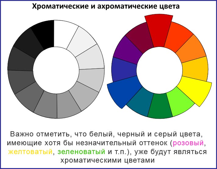
- The secret of the designers is the rule of three. All colors are made to divide into two groups: chromatic and achromatic. The first option includes bright shades: blue, green, red and others, to the second calm: black, gray, white. According to the rule, in one room it is recommended to combine no more than three chromatic colors. This does not apply to achromatic.
But even the fulfillment of all rules and good imagination will not give a real idea of \u200b\u200bhow the wall will look like. For this purpose, a test painting of a plot of at least 1 m2, which is completely repeating technology. Naturally, such an event is not always possible.
Important! The exact following instructions placed by the manufacturer on the label or in a separate brochure is a prerequisite.
Perception of color palette
Any professional designer knows that each color at an unconscious level has an impact on emotional perception. A person can feel constant fatigue or irritation and blame everyday circumstances, although the reason for the wrong color of the paint.

It is advisable to take into account the following features of various shades:
- Red. It has an exciting effect. In small quantities, positive processes can stimulate, and in excess causes aggression and irritability. Permanent contact with this shade leads to fatigue and psychological devastation.
- White Universal color, which is capable of making space more spacious and remove a sense of tension, but in large quantities will lead to the opposite effect. In addition, he causes associations with therapeutic institutions.
- Yellow. A small amount of this color gives confidence, creates a cozy atmosphere, and the surplus sets up anxious way and gives rise to distrust. A similar effect has an orange color.
- Blue. Contributes to pacification. The predominance of such a shade does not affect so harmful, but it may interfere with the working way.
- Green. Creates associations with trees and vegetation. Applies strength, it is cheery and helps to focus on the task set.
- The black . The color of rigor and tact is responsible for maintaining solidity, but the excess leads to depression.
In order not to make a mistake in the selection, you should be guided by simple rules:
- Everything is good in moderation. This postulate is fair for any color palette.
- Natural shades are the most correct. You can mix paint as you like and get amazing combinations, but everything you need already exists in nature.
- Professional masters and designers are a great set, but everyone has its own idea, therefore their tips must be only auxiliary.
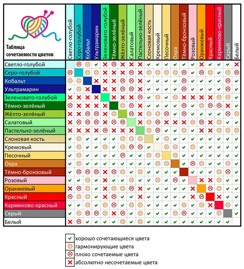
With a combination of various colors, compatibility assessment is pre-carried out. To do this, you can be guided by individual perception or use special color solutions.
Fashion colors 2018 and the first half of 2019
To find the desired range of shades, you can take advantage of the 2018 trend and remaining in the trend in the first half of 2019.
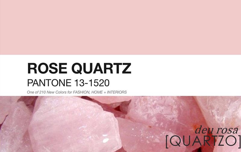
- Rose Quartz. Otherwise - pink quartz. This color emphasizes the nobility, allows you to tune in to a calm way. Being universal for all rooms, it is diluted with violet or pearl shades.
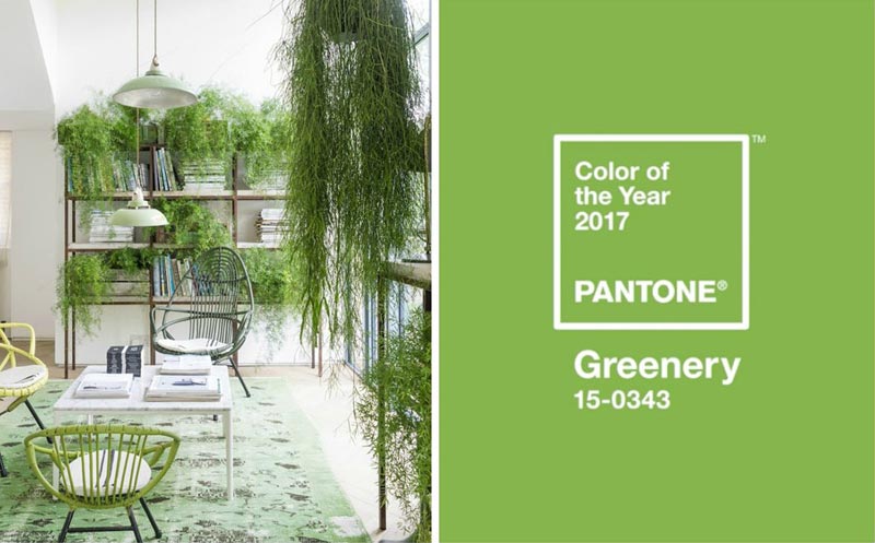
- Greenery. Light green color, which is a fairly popular solution. It can become a real decoration of any interior, combined with many tones, but more to natural, natural.
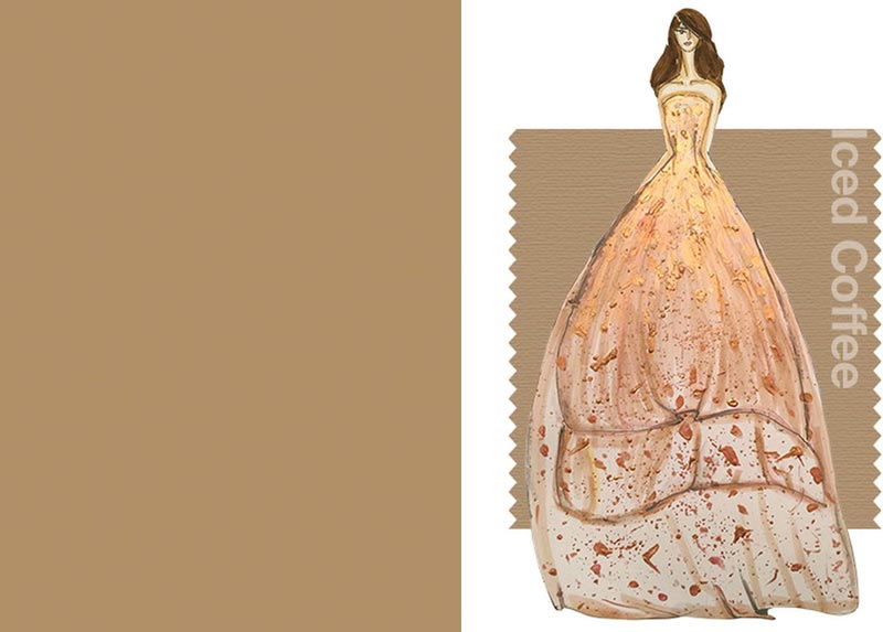
- Iced Coffee. Cold coffee is great for modern (high-tech) and classic interior directions. It gives a feeling of comfort and stylish. Diluted with peach dye.
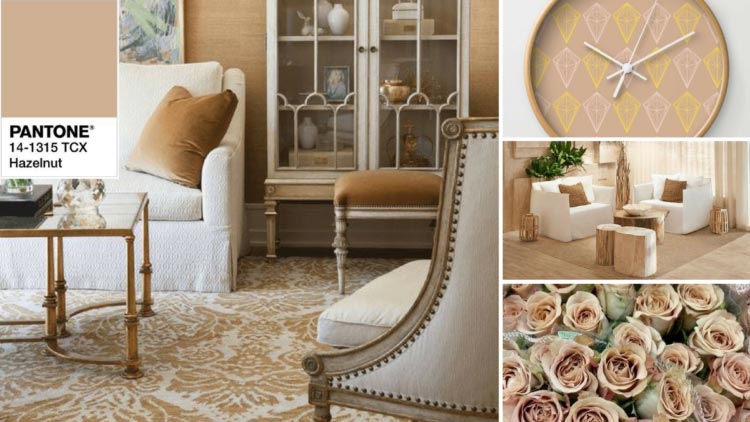
- Hazelnut. Universal color, which perfectly fit into any space and becomes an indispensable companion for all shades. To enhance the effect, an orange or pink accents can be used in the interior.
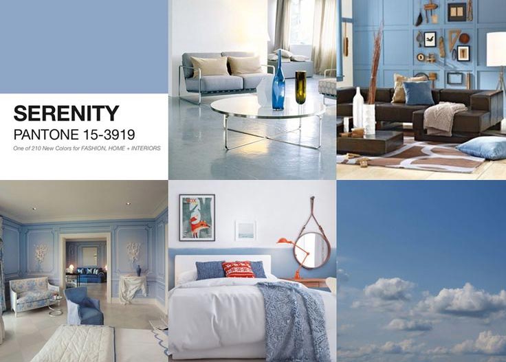
- Serenity. Again in the trend blue-lilac color. Blue is the main and gives the room depth, and lilac - expressiveness. Combined with pink quartz or peach tint.
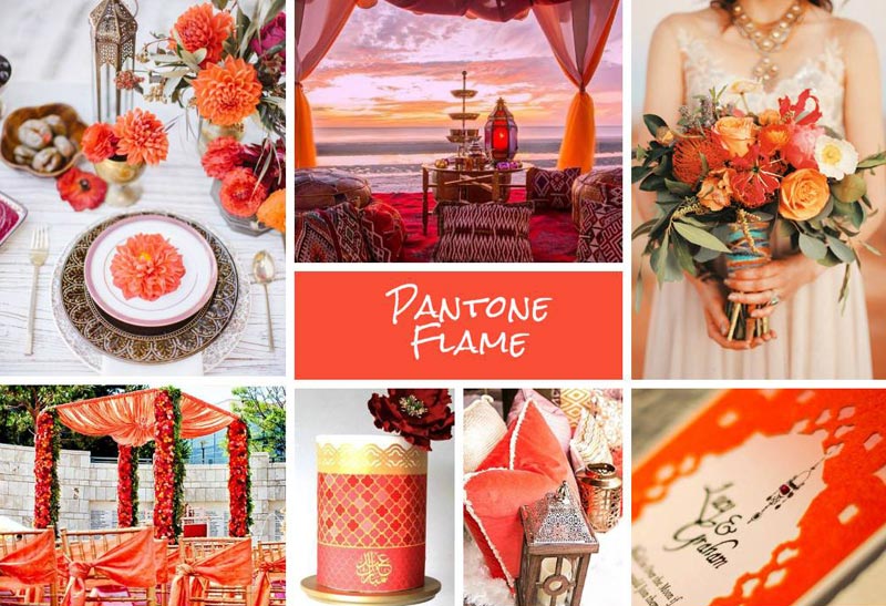
- Flame. Orange-red, resembling the flame is an option for strong and confident people who are constantly in motion. Suitable for folding accents, combined with moderate shades.
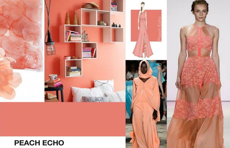
- Peach Echo. A gentle-peach color remains still an elegant solution for the exquisite interior, the objects of furniture are chosen with a special taste. Such painting of walls is complemented by dark accents and paintings. Most successfully finds its use in living rooms, sleeping and children's rooms.
Painting of walls in different rooms
Individual preferences when choosing a suitable color for walls in the room are dominant, but to achieve an optimal result, some recommendations should be taken into account.
Parishion
This room in most apartments and houses differs very modest sizes, so the optimal color for such a room will be light (beige, ivory, orange) with possible more vivid accents. Due to this, the hallway will seem much more.
Corridor
If the corridor is narrow, then it uses several shades for its painting, to be placed that are recommended in the form of horizontal strips. An interesting solution will be the creation of black central or side boundaries. Basic color can perform gray, light brown, beige.
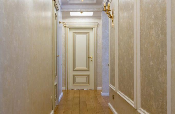 In the corridors, there is usually lacking daylight, so the main palette of the walls for the walls should be blond tones
 Living room and gym
Provided that the room is constantly going to all living, the optimal blue, blue, purple and pink shades are optimal. They are complemented by gold, red and gray. For the premises used in other situations, a more rigorous interior is selected with the predominance of cold colors.
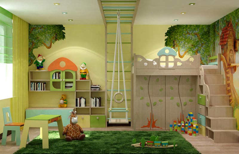
Children's
Pick up the paint for nursery is harder because you need to take into account the preferences of a child or a teenager. A sexuality of weighty: boys are in bright and complex combinations of colors, and girls prefer calm pink and beige shades with juicy splashes. Naturally, such interpretation is often conditional, therefore, taking into account the wishes of the child, the optimal option is to use natural colors and their shades.
Bedroom
This room should contribute to relaxation and comfort, so the walls can be painted in yellow, orange and green shades. It is better to abandon new-fashioned and experimental solutions that can look good on paper or in the pictures on the Internet, but in reality they create an absolutely depressing impression.
Kitchen
If furniture objects are provided for bright shades, the walls are painted into a contrast tone. If kitchen modules have a natural colors in classical interpretation, similar bright or dark shades are selected. But to create a modern interior wall, you can paint in bright colors: red, orange or indigo.
Cabinet
For this room, brown, gray and beige shades are suitable, which can be complemented by black accents. Everything must be configured on a calm and business way. Modern cabinets for creative personalities is better to paint in green, red and blue color or their combination.
Bathroom
Bathrooms are rarely found, moreover, many of them include several zones, so individual colors are selected for each site. For such a room, blue, purple, dark blue and light green shades, having splasions of red or black, are well suited for such a premises.
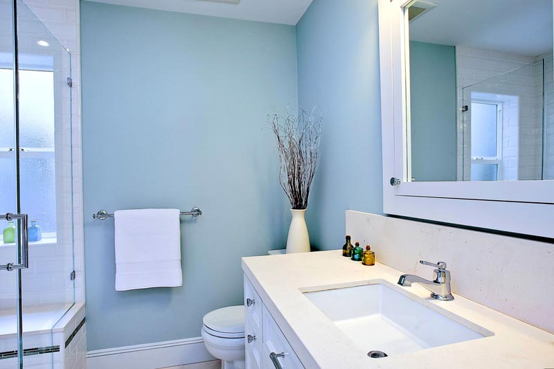 The bathroom is associated with water, so for its painting most often choose the blue color and its shades
 The main thing when choosing the color of the room is to take into account the shared style of the house or apartment.
Influence of shade on visual room size
Each shade affects not only a psychological perception, but also on visual. The correct color for wall surfaces allows you to expand or narrow the room.
Principles of staining:
- Small premises are better to make calm, light tones, thereby reinforcing artificial lighting and visually expanding the area.
- To high ceilings seem below, you can paint the walls in pastel colors, and the ceiling itself is in darker. Such a combination will increase the overall space.
- Unsaturated green and blue visually expand the room.
- Relief moldings painted in the same color will help to enlarge the wall.
- With a small area of \u200b\u200bthe room, you should refuse to cause solutions and combinations of a set of tones. This completely levels the feeling of space due to the inability to concentrate. Also, an artistic painting will be not the best solution, especially with large elements.
- To reduce large premises, orange and red shades are used, and to underline their status - deep gray and dark.
On a note! Since it is impossible to perceive all combinations, it is necessary to resort to the use of special graphic programs. Modeling the color in them is not always completely reliably, but it allows you to catch a good combination or reject the unsuccessful.
Select color from the point of view of Fengshui
Fengshui is a Taoist practice responsible for organizing space. Based on this teaching, each element has its own color:
- water (North) - black;
- earth (northeast, southwest, center) - brown;
- tree (East, South-East) - green;
- fire (south) - red;
- metal (West, North-West) - white.
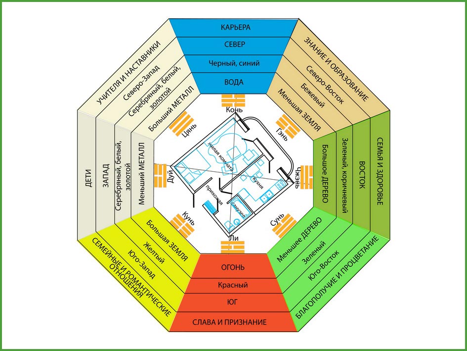 Bagua - Fenzui zone map
 According to this Eastern practice common in Asian countries, each color has a certain impact on a person and is used for different premises:
- Yellow. Symbolizes the sun, abundance and wealth. Creates a feeling of fun, comfort, strengthens hope and binds a person to the house. Not suitable for dark rooms and bathrooms.
- Red. It is responsible for the vital energy, therefore it is recommended for the device of the offices, but its excess leads to the opposite effect. Suitable for distinguishing space and zoning. Do not use in places of recreation, hallways and bedrooms.
- Blue. Mysterious color, developing craving for adventure and research. It is used for the device living room, bedrooms and cabinet sections. The bad solution will be for the kitchen, hallway and corridor.
- Green. The basis of a new life, proper activity, but bright shades speak of possible immaturity. Used for a children's and teenage room, is great for purposeful young men and girls.
- Orange . May act as an additional color in the living room or a short-term recreation area. It should not be painted with the walls in the cabinets and bedrooms.
- Peach. Symbolizes calm and is responsible for romantic attractiveness. Suitable for a room in which a teenager lives, especially the girl. A slightly diluted tint is stained with a hall and a bedroom.
- White Symbolizes purity and openness. It is used for walls in a children's and living room and to highlight zones in the kitchen.
- The black . Responsible for strength and solidarity, contributes to the creation of intrigues. It is recommended to use shades of black, suitable for certain parts of the walls. For children, teenage, working and recreation area is not recommended.
Due to the fact that the modern interpretation of this practice has undergone changes, many values \u200b\u200bare fully adapted to the current conditions and lost its initial meaning.
Errors when choosing a color palette for walls
Errors when choosing paint color, generating psychological discomfort:
- The period of illumination is not taken into account. At different times of the day, natural lighting may vary, so the presence of artificial light sources is of great importance.
- All details are influenced by all parts, and especially furniture: sofa, chairs, tables, cabinets must approach the main tone or contrast.
- In Fengsui, a combination of colors take into account, because practice is built on an infinite movement of space. The poor solution will be used in one room of yellow and green, red and black, yellow and blue.
But most problems arise due to fear to be mistaken. It is impossible to please everyone or adapt to each opinion and recommendation, it is the individuality that creates harmony. An example is the conditional ban on the color in the dark color of small rooms: when a certain shade is selected, the result may be amazing.
 Facade design of a country house: a variety of stylistic directions
 Wooden ceilings - 25 interior examples
 How to make a children's game lick with your own hands