Green wallpaper in the interior: how to give the space freshness and 50+ best combinations
Not only the appearance, but also the mood of the room and its inhabitants depends on which color is chosen as the main one. Therefore, the choice of color should depend not only on personal preferences, but also on the semantic load of the shade and the purpose of the space. No one thinks of decorating a bedroom for a newborn in dark shades, but green wallpaper in the living room can become the basis of a cozy interior, conducive to family conversations and leisurely relaxation. It is the green color that is considered that almost universal shade that can fit perfectly into any style and any direction, which is ideal for any room - from a children's room to the kitchen.
Green wallpaper in the interior: from fresh mint to deep malachite
Green color in the interior is considered the optimal solution if the owners of the room cannot make a choice in favor of a particular color. It is the shades of this color in their diversity that can make any room an example of style and sophistication. Regardless of the chosen shade: be it cool olive or juicy lime, the color will always calm and pacify.
Healthy! - 44 photos, weighing the advantages and disadvantages, considering options, choosing a style
Psychotherapists call this color the most calm and conducive to harmony, and the thoughtful design of rooms with green wallpaper is a guarantee of an excellent mood for all inhabitants of the apartment. In the modern world, with its eternal bustle and frantic pace of life, which not everyone can keep up with, there is no room for peace in a person’s life.
This is why designers recommend using green in the interior of apartments and houses: it is not at all necessary to make this color the dominant one; a few details or the partial presence of this life-giving shade is enough to normalize a person’s psycho-emotional state.
Some explain this effect by a person’s instinctive desire to get closer to nature, others – by pure psychology and the effect of color on a person’s mood.
Using green depending on conditions
The choice of a particular shade of green begins with determining the requirements that apply to it. The main conditions for choosing a shade are the style of the room and its functions.
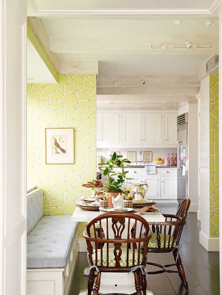
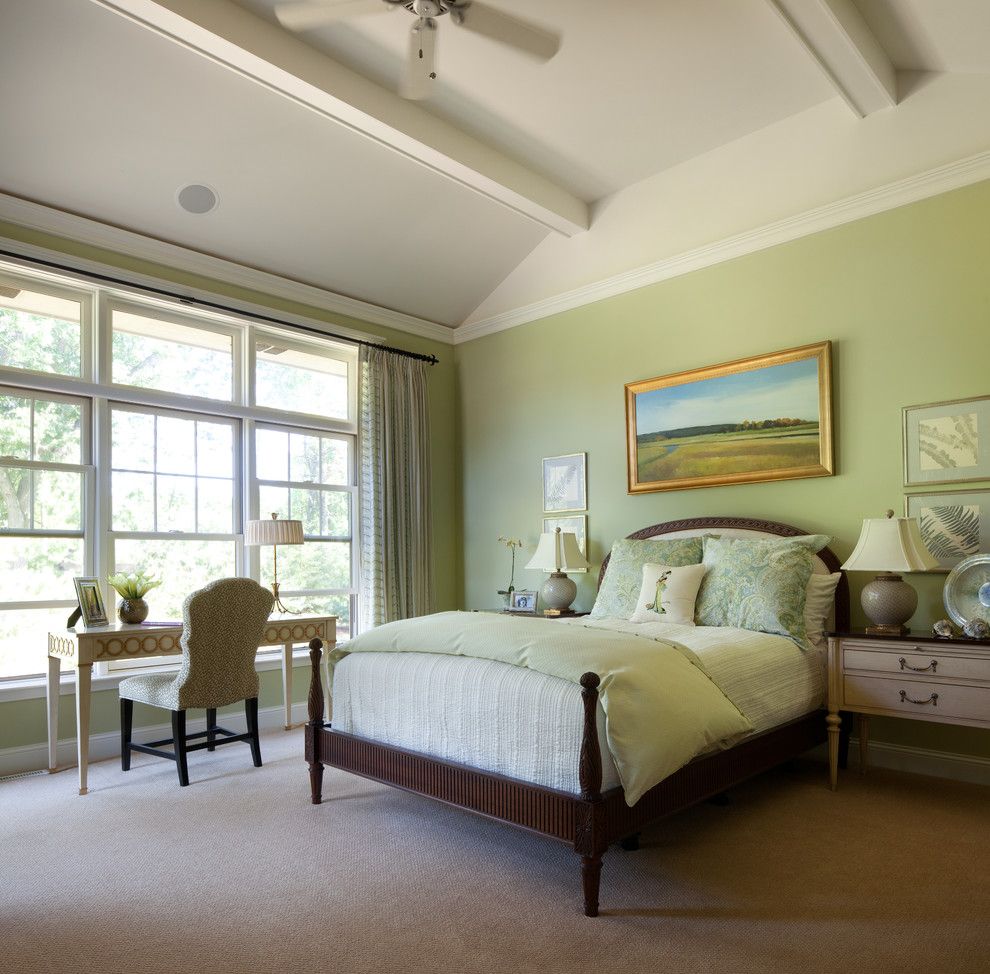
- So, if you choose green wallpaper for modern bedroom and kitchens, then you should focus on pastel or fresh colors. Similar wallpaper in the kitchen promote maximum relaxation and rest.
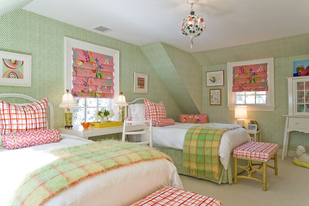
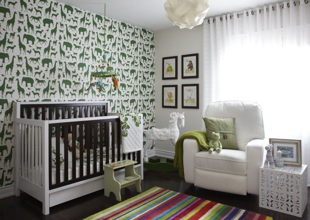
- For children's rooms, it is recommended to choose calm versions of warm greenery - pear or yellow-green. They will create an atmosphere of coziness and comfort, which is extremely important for a small inhabitant.

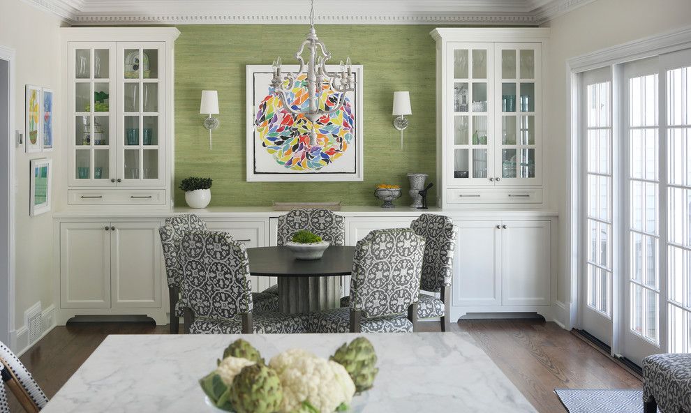
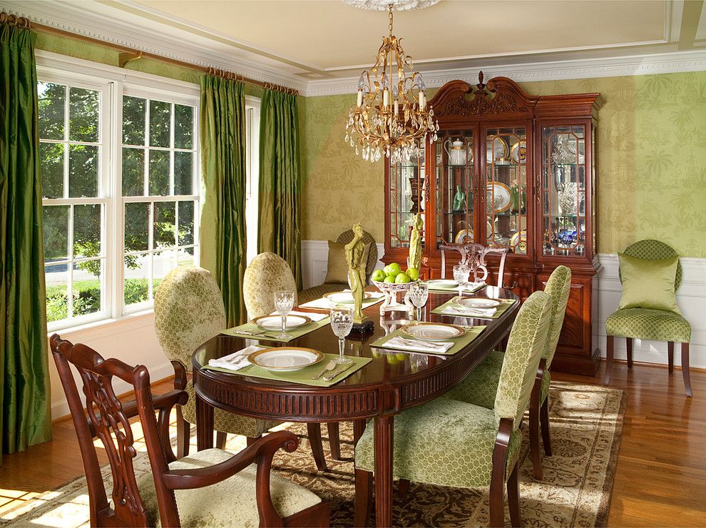
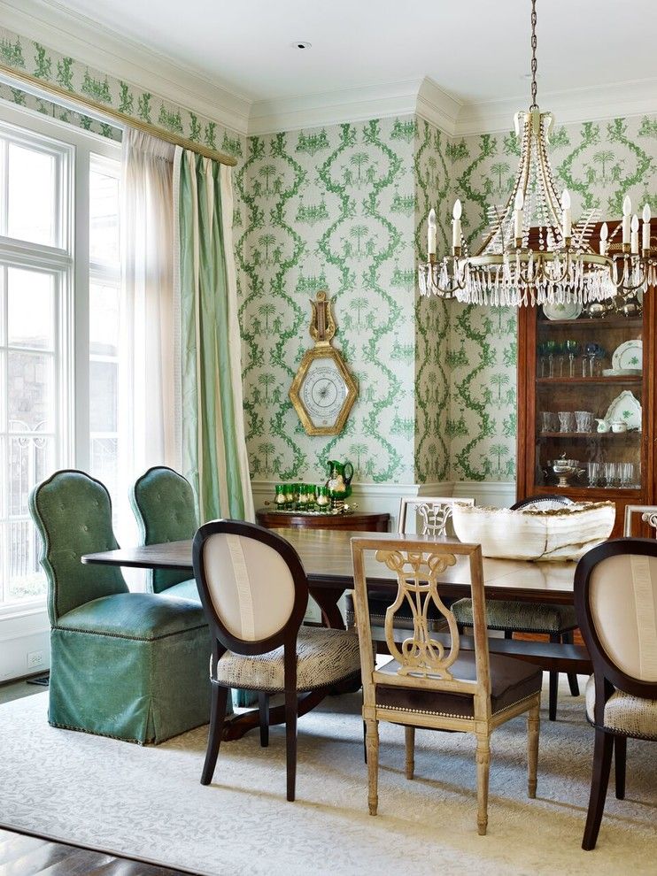
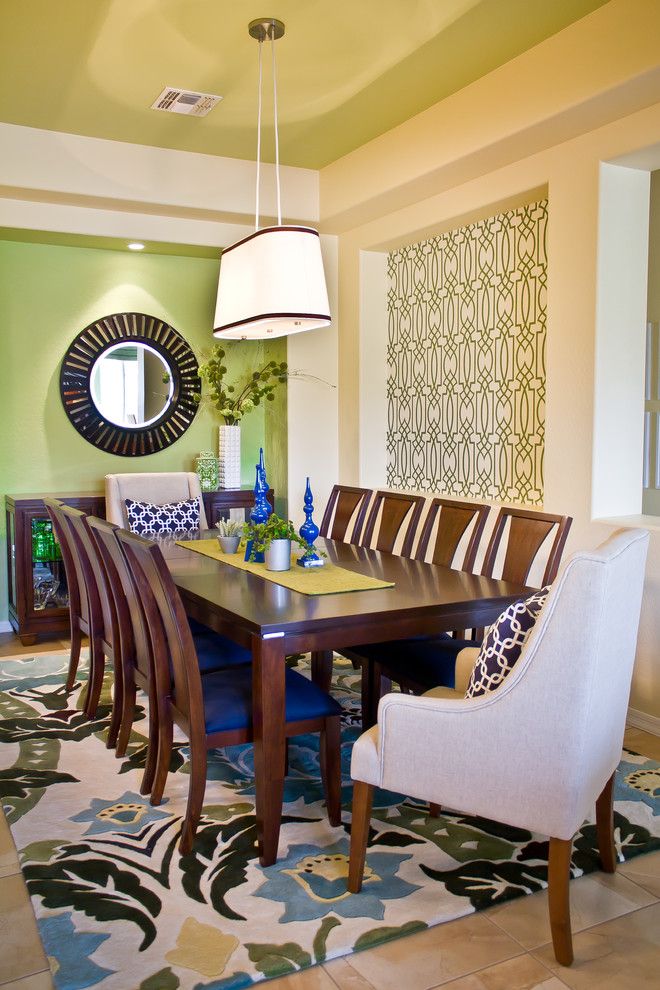
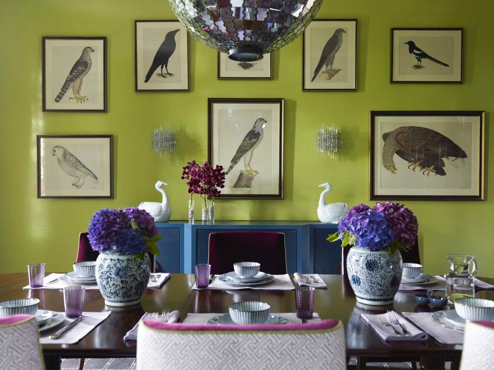
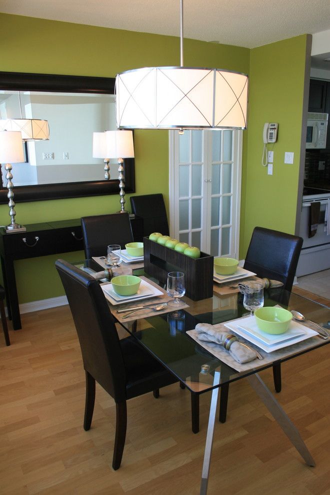
- When decorating a living room, wallpaper for green walls would be ideal: bright emerald green or strict asparagus green. In this case, the chosen shade must be balanced with other colors.
Designers do not advise combining several shades of greenery in one room - this is fraught with emotional overload of the interior and creating a dull, faded picture.
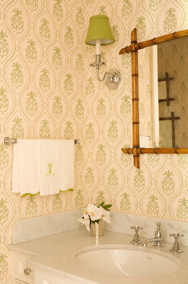
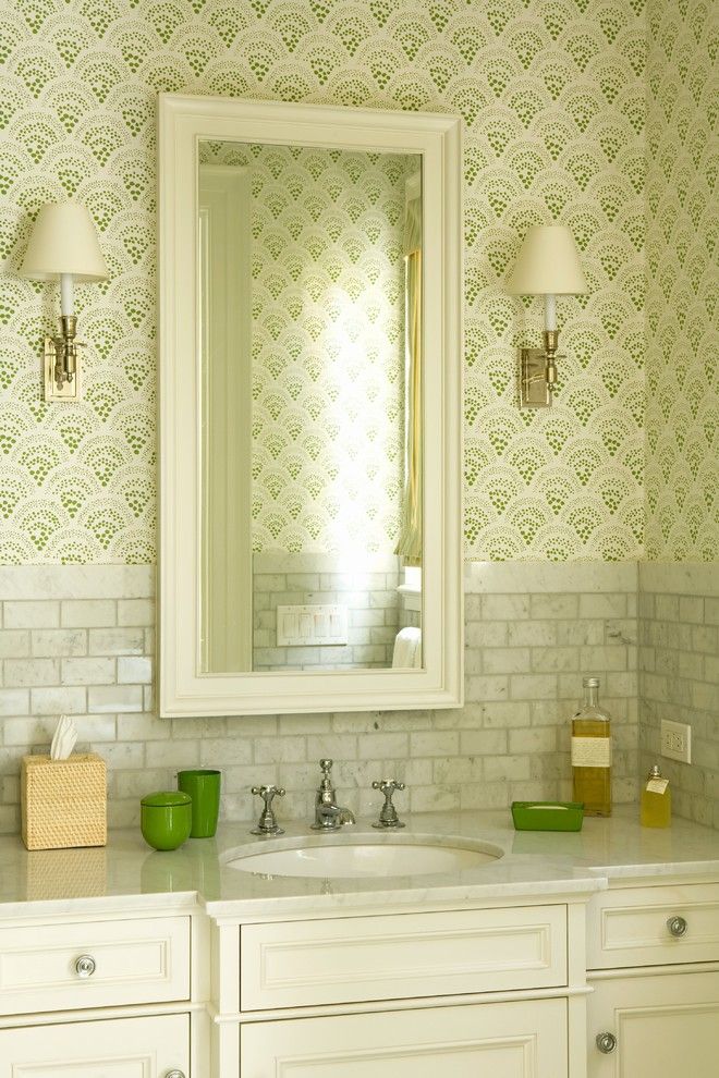
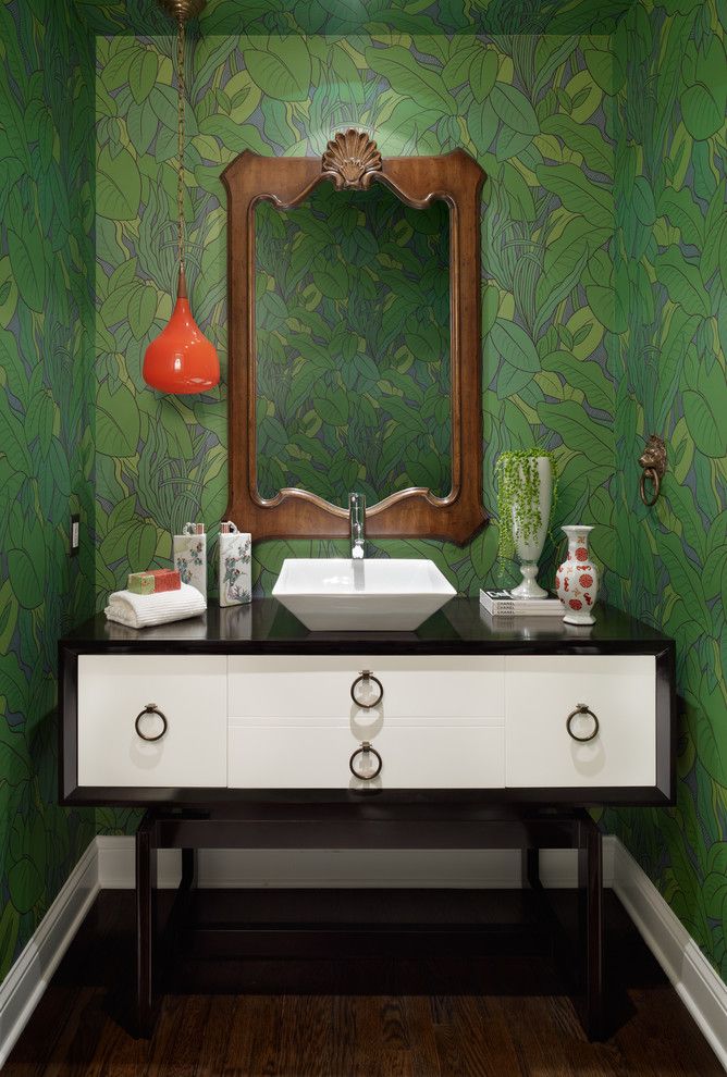
- For the bathroom, corridor or a balcony, you should not use dark and cold shades. In small rooms, warm options look more impressive - for example, spring or lime greens.
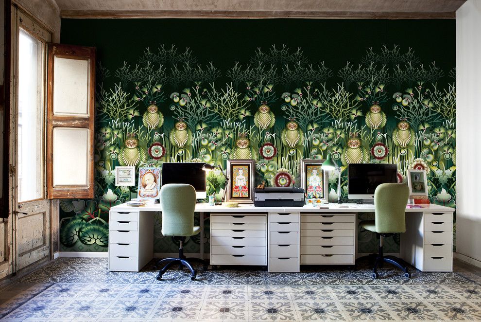
- Choosing green color for decoration office or simply a workspace considered ideal. This color stimulates the brain, helps you concentrate and make decisions. Deep shades are most often used here - emerald or malachite.
The style of the room is another factor that influences the choice of a particular shade of greenery for the interior. The difficulty is that for some styles designers do not recommend using this color at all, since it negates all efforts to create an authentic image of the room: for example, you should not overuse it in decorating rooms in the art deco style or modern.
- Shades of green in the interior style minimalism- This is a common phenomenon accepted by most specialists. Greenery can perfectly highlight the simplicity and laconicism of the style, introducing a touch of liveliness into a strict interior.
- For the classic style, dark, deep and rich colors are more suitable - emerald, myrtle, jade. These shades emphasize the sophistication and complexity of the style, highlight chic and luxury.
- Lightweight and uncomplicated Provence or country style- an ideal background for pastel light green, spring greens or light moss colors. Most often, these shades are used in textiles, but there are often cases when walls or floors are made green.
Green wallpaper in the interior: harmonious combinations
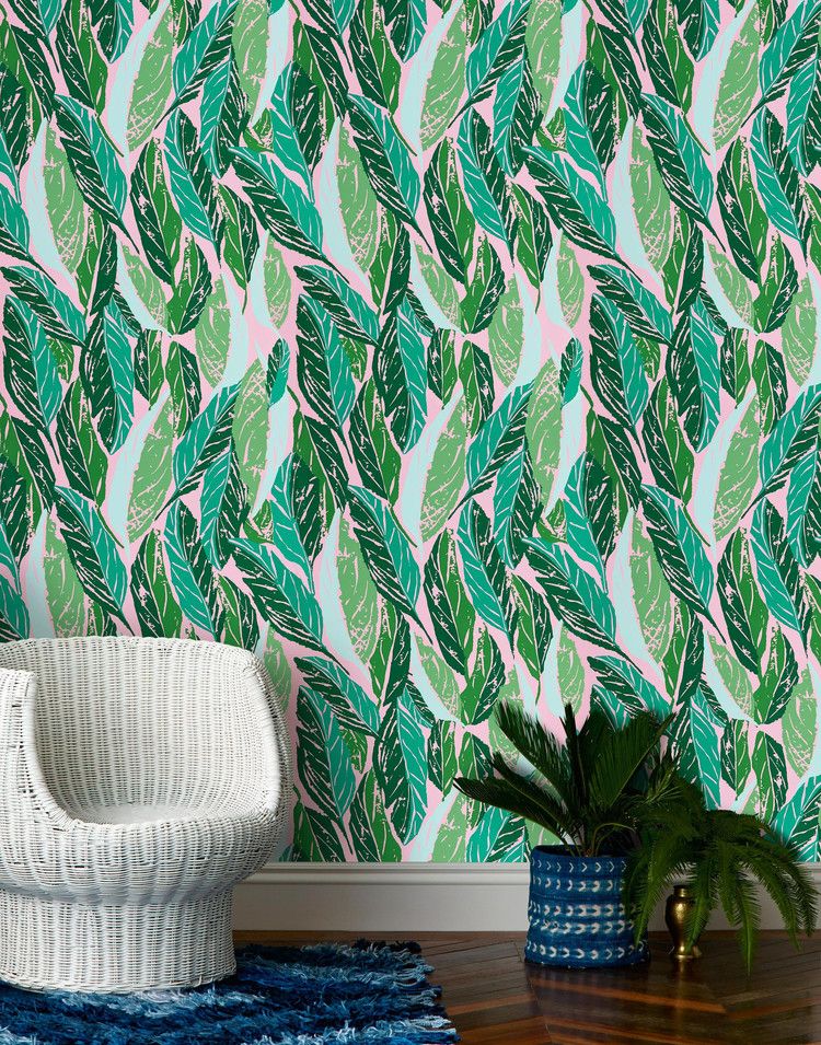
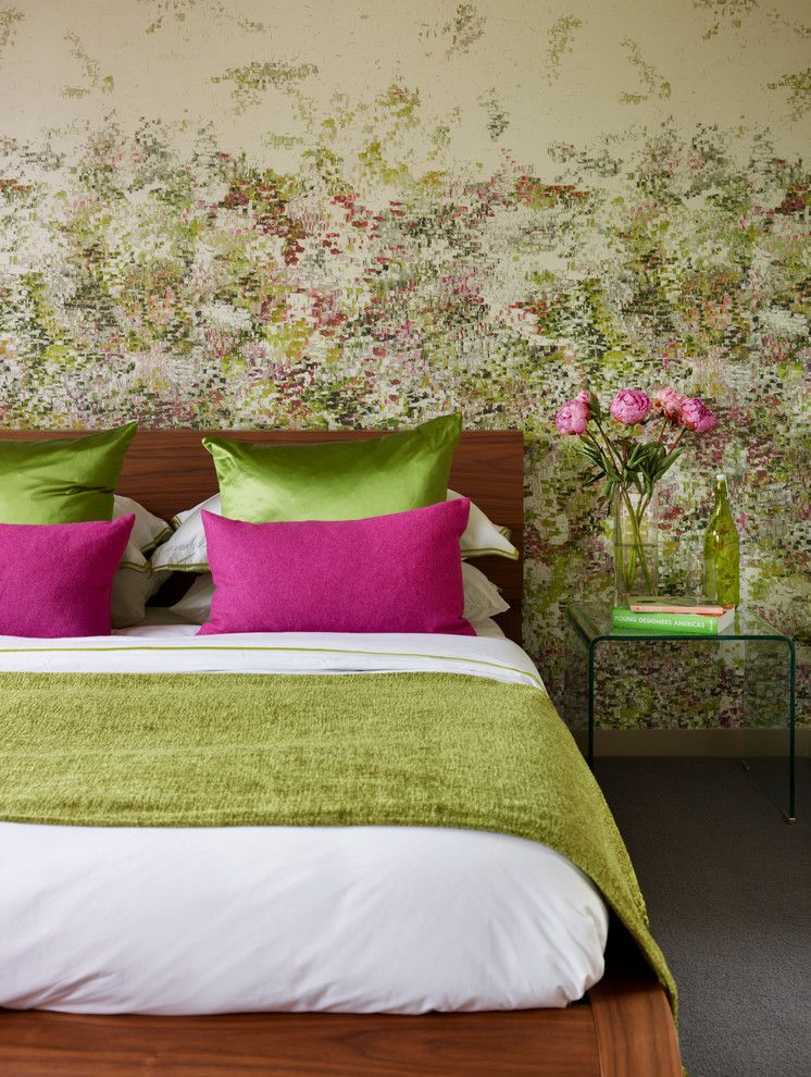
Any combination of green with others is not just design options, it is a real opportunity to fill this shade with new meaning and give it depth. Combinations of any greenery with all sorts of options, from white to orange - these are new images, new meanings and new horizons.
- The combination of green and white is considered classic: this choice is simple, but original. In addition, this combination can be used in any room and any style. Designers recommend using light shades of green and combining several variations of the primary color with white.
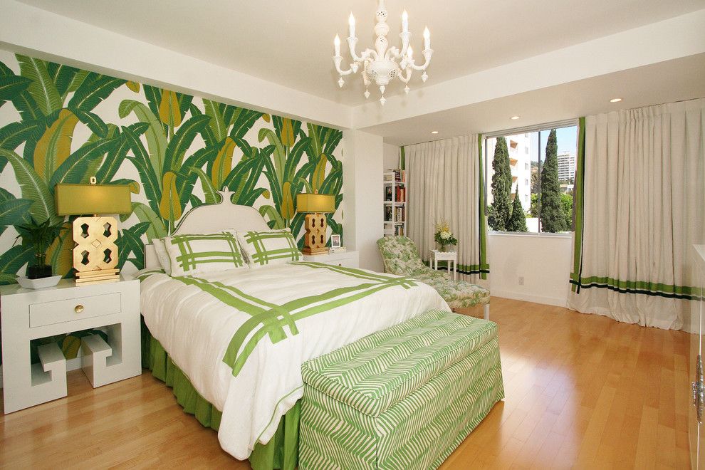
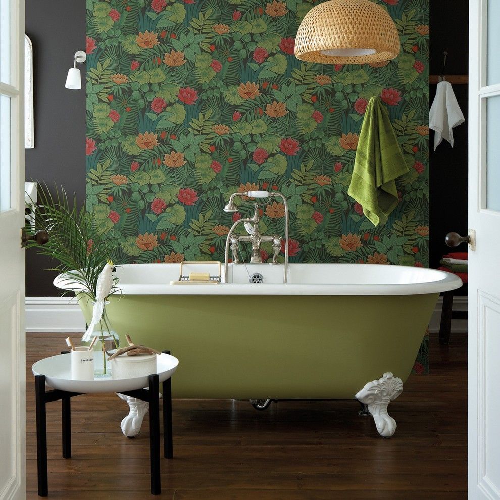
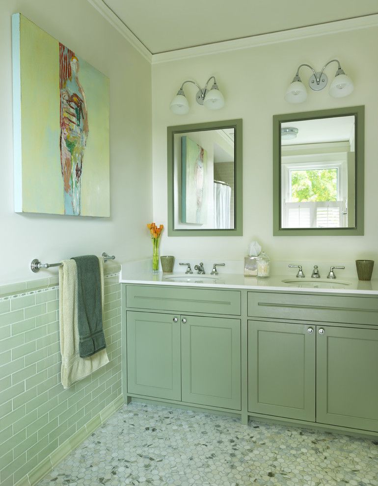
An image of tropical leaves on the central wall of the bedroom in three shades of green. A beige backing and a warm green floral print – a calm bathroom interior.
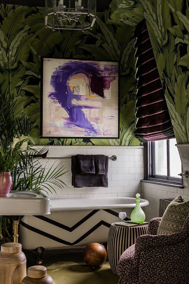
- The combination of dark green and black seems too gloomy to many, but with proper design and a thoughtful approach, this combination of colors in the interior can make even a simple room surprisingly deep and filled with meaning.
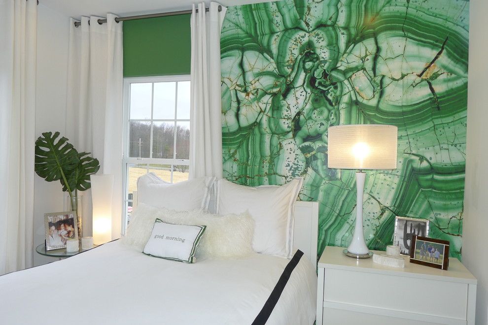
Dark wood in the design of furniture and floors, a panel above the bed in the color of green apple, pillows in different shades of green and other interior elements that emphasize the classic combination of green and brown in the interior
The lighter the green, the darker the brown should be, and vice versa.
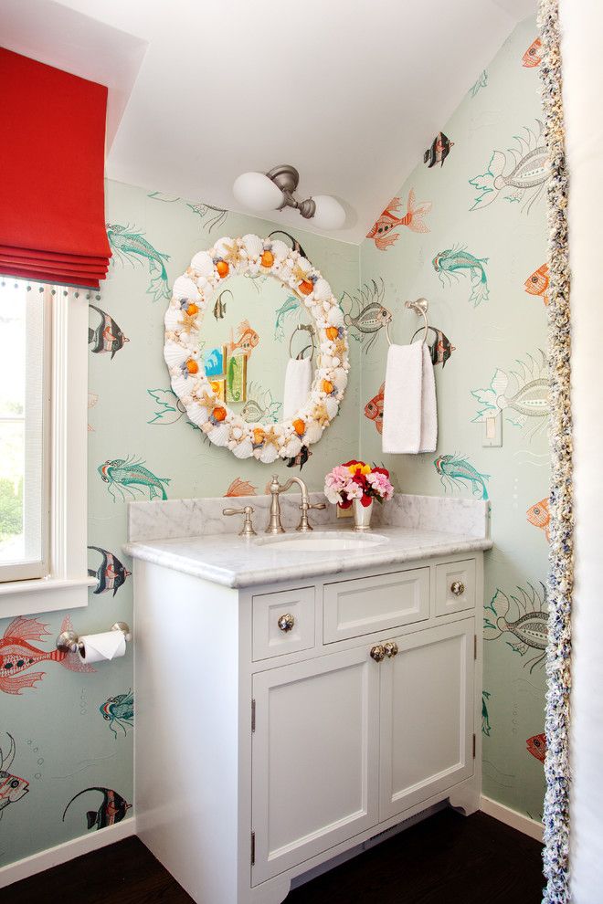
- A fabulous and somewhat unreal combination of green and blue in all its variations is an excellent solution for a bedroom or living room. Designers advise choosing colors that are close in tone and achieving a transition from one to the other: in this case, the duet will look the most harmonious. Beachy bathroom style, highlighted by marine-themed mosaic effect wallpaper. Furniture and accessories have a white and blue color scheme
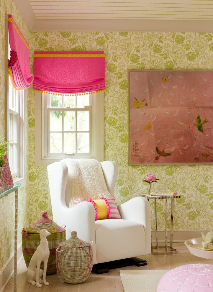
- If green is complemented red, pink, orange or yellow - means it’s spring. Such a warm and juicy tandem is considered the most optimistic and cheerful, open and fresh. At the same time, the accompanying color should be used carefully and carefully: in decoration, in details - pointwise and carefully.
Green is one of the favorite colors for designers to decorate living spaces, characterized by a variety of shades and meanings. Using different types of greenery allows you to emphasize interior details, make smart accents and create coziness in any room.
 Country house facade design: a variety of stylistic trends
 Wooden ceilings - 25 interior examples
 How to make a children's playhouse with your own hands